The Best AI Image Generator for Non-Designers
You don't need to know color theory or composition rules to get a usable image out of AI — you need a plain-English description and a sense of what these tools actually can't do yet.
I don't have a design background, and for most of the images I need day to day — social posts, blog headers, a slide background — I don't think that's actually a disadvantage anymore. The thing that used to require Photoshop skills or a Fiverr order now mostly requires being specific in plain English. That's a real shift, and it's worth explaining how to actually use it if you've never touched a design tool in your life.
You describe it like you're talking to a person, not a machine
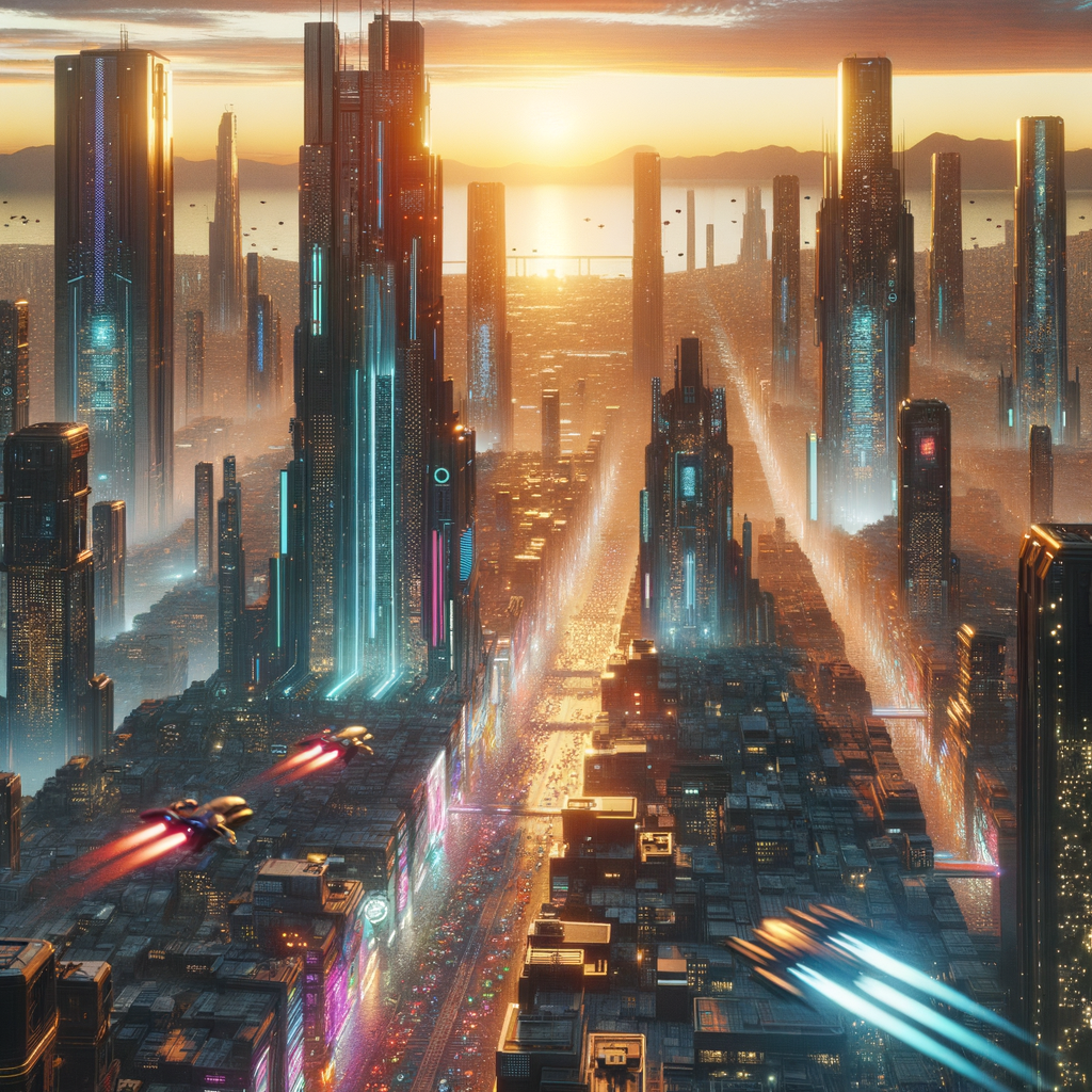
The biggest mistake I see people make when they're new to this is writing prompts like search queries — three keywords stacked together. "City sunset dramatic" gets you something, but it's a generic something. Write it like you're describing a photo to a friend over the phone: what's in it, where it is, what it looks like, how it feels. Full sentences beat keyword soup every time.
A prompt recipe that works almost every time
If you don't know where to start, this order covers the four things that matter most:
1. Subject — what's the main thing in the image? Be concrete: not "a person," but "a woman in a yellow raincoat."
2. Setting — where is this happening? "Standing on a rain-slicked city street at night."
3. Style — how should it look? "As a photograph," "as a flat illustration," "as a watercolor painting." This one word changes the output more than almost anything else you'll add.
4. Mood — what's the feeling? "Moody and cinematic," "warm and inviting," "bright and energetic."
Put together: a woman in a yellow raincoat standing on a rain-slicked city street at night, photograph style, moody and cinematic. That's a complete prompt, and it's not hard to write once you know the four slots you're filling in.
Real things people actually use this for
- Social posts. A quick on-brand background image beats a stock photo that three other accounts already used this month.
- Blog headers. Instead of hunting stock libraries for something that vaguely matches your article, you describe the exact scene your post is about.
- Slide backgrounds. Abstract, on-theme visuals for a deck without opening a design tool or paying for a stock subscription.
None of these need pixel-perfect precision — they need "good enough and on-brand, fast," which is exactly where this tech is strongest.
What it's still bad at — worth knowing before you rely on it
I'd rather tell you this upfront than have you find out mid-project:
- Text and words inside images. Logos, signage, labels — anything that needs legible text tends to come out warped or nonsensical. If you need readable words in the image, plan to add them yourself afterward in a simple editor.
- Hands. It's better than it used to be, but extra fingers or oddly bent joints still show up often enough that I check hands specifically before using any image with a person in it.
- Exact layouts. If you need a very specific arrangement — this logo exactly here, this text exactly there — you're better off treating the AI image as a background and adding the precise elements yourself. Asking the model to nail an exact layout in one shot usually disappoints.
None of these are dealbreakers, they're just the current edges of what the tool does well. Once you know where they are, you stop wasting prompts trying to force it past them.
If you're generating specifically for social platforms, prompts for social media has more patterns tuned to that use case. And if what you actually need is a product image rather than a general scene, product mockups covers that differently — it's a narrower problem with its own recipe.