AI Image Prompts for Social Media Graphics
Most social graphics fail before the prompt even matters — wrong aspect ratio, inconsistent style, no room for text. Here's how I avoid that.
Anyone running a social account eventually hits the same problem: you need a fresh graphic every day or two, and hiring a designer for every post isn't realistic. AI image generation can fill that gap, but only if you handle two things most people skip — sizing for the platform, and keeping a consistent look across posts so your feed doesn't look like ten different accounts.
Get the aspect ratio right before you generate
Figure out where the image is going before you write the prompt, not after:
- Square (1:1) — still the safest default for feed posts and works across most platforms.
- Portrait (4:5) — takes up more vertical space in the Instagram and Facebook feed, generally gets more visibility than square.
- Story/Reel (9:16) — full-screen vertical, for Stories, Reels, and TikTok.
Check what sizes your generator actually supports before you commit to a layout — Imagify's generation sizes are listed on the generate page, and not every ratio you might want is available as a native output. If your target ratio isn't offered directly, generate at the closest supported size and crop afterward, but leave "copy space" or margin in the prompt so cropping doesn't cut off the parts you need.
Keep a consistent look across posts
The fastest way to make a feed look cohesive without a designer is to reuse the same style phrase and color language in every prompt. Pick two or three descriptive words up front — for example "bold gradient, modern, high contrast" — and paste that same fragment into every prompt for that week or campaign. The subject changes, the style anchor doesn't.
A few prompt patterns I go back to constantly:
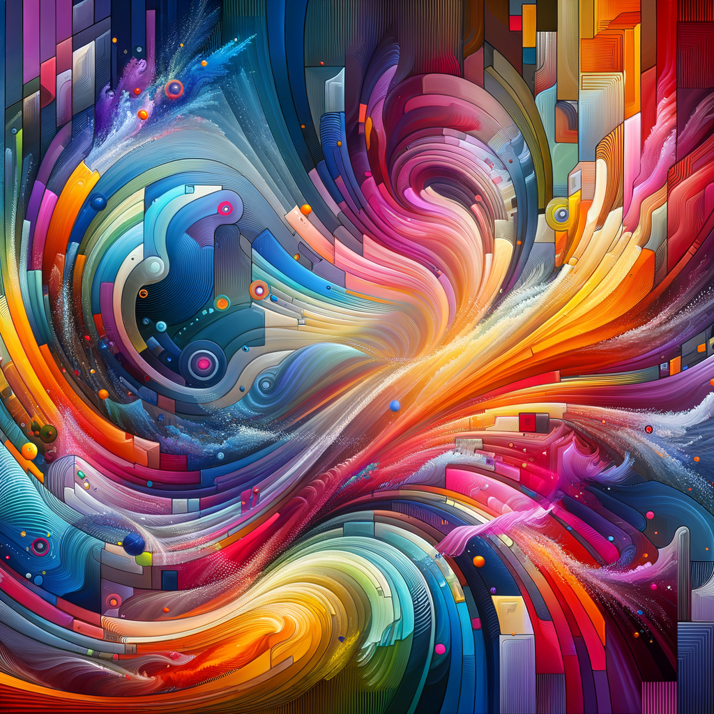
- Post background: vibrant abstract background for an instagram post, bold gradient, modern, copy space
- Quote card backdrop: soft gradient background, minimal, muted tones, large empty area for text overlay
- Video thumbnail: bold graphic background, high contrast colors, dramatic lighting, space for title text
Notice each one ends with a note about where text goes. If you're going to lay a headline or quote on top in Canva or Figma afterward, tell the generator to leave room — otherwise it fills the whole frame with detail and you end up with text fighting the image for attention.
Where it struggles / what to watch for
Abstract backgrounds and textures are where this works best, and that's not an accident — the model has a lot of freedom and nothing needs to be "correct." It gets shakier the moment you need something specific to hold together:
- Any text baked into the image comes out wrong more often than not. Add your headlines and captions afterward in a design tool rather than asking the generator to render words.
- Faces and brand mascots won't stay consistent between generations, so don't expect the same "character" to reappear across a week of posts — for that, plan on a real illustrator or a fixed set of assets you reuse.
- Exact brand colors are approximate at best from a text prompt. If your brand has strict color codes, generate the image, then correct the palette in your editor rather than trusting the prompt to hit the hex value.
For more prompt structures beyond social graphics, see marketing asset prompts. And if you're deciding whether AI generation is even the right tool for someone without design experience, I go into that in best AI generator for non-designers.